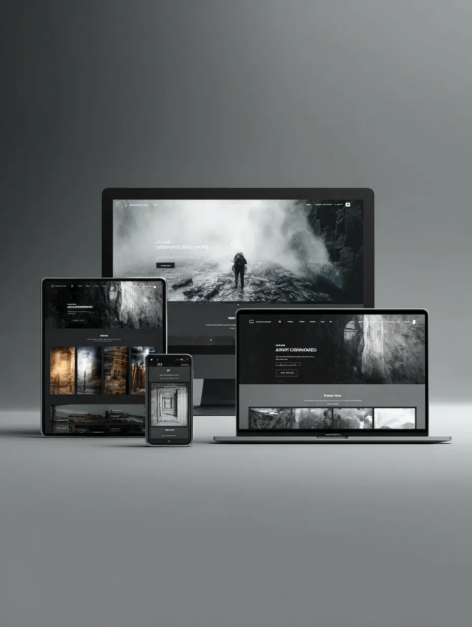
Responsive web design Southampton is a powerful way to attract and engage local customers, build credibility for your services, and stand out in a competitive digital landscape. We know from experience that a well-structured website can make all the difference for businesses of all sizes and types. Whether you run a shop around the corner or manage a thriving e-commerce store, being responsive has become a must in today’s mobile-first world.
Our team believes in designing sites that instantly adapt to any screen size, so your visitors can explore with ease whether they’re on a laptop, tablet, or smartphone. After all, when people have positive first impressions, they’re more likely to trust you, stay longer, and even recommend your site to friends. Ready to learn more about how a responsive website can elevate your online presence in Southampton? Let’s dive in.
Understand responsive web design
Responsive design is more than just squeezing text into a phone screen. It’s a design philosophy that ensures your layout, images, text, and interactive elements rearrange themselves naturally to match any device. This is key in a city like Southampton, where your audience might browse on the move.
Key advantages of responsiveness
- Simplified navigation: Visitors see straightforward menus and buttons that scale well. No awkward zooming.
- Faster load times: Proper coding and mobile-focused layouts help pages load quickly on all devices.
- Consistent experience: Nothing frustrates users more than a jumbled display on smartphones. Consistency keeps them engaged.
- Future-proof approach: As new devices emerge, your site is more likely to accommodate them without a full redesign.
If you’re juggling tasks at your own salon or law firm, you want a website that’s low-maintenance yet modern. Responsive design covers that. With one core layout that adjusts itself, you avoid managing multiple site versions. It’s a sleek approach that fits the fast pace of local businesses in Southampton.
Maximise user experiences
Why should you care about how comfortable visitors feel on your site? Because user experience (UX) is directly linked to whether people stick around or head off to a competitor. A responsive web design for the Southampton area keeps your core audience in mind. Essentially, no matter where they are or what device they use, you want them to find information quickly and have a smooth visit.
Building trust with clarity
Think about how you feel when you land on a cluttered webpage. Confusion sets in, right? That’s exactly what we want to avoid. Clean, intelligent design makes it easy for visitors to read content, check your services, and follow a clear path. For instance:
- Structured page flow: Place the most important information at the top, and then guide visitors through your offerings.
- Visual hierarchy: Highlight crucial calls to action so visitors always know where to click next.
- White space: Don’t be afraid of breathing room. Let your content stand out instead of overwhelming people.
Making navigation habitual
Good design is almost invisible, because it feels natural. When you have a local shop, you want your store page or directions button front and center for mobile users. If you’re a consultant, you want your “book a meeting” option easy to tap on any device. The simpler these elements are, the more likely folks will convert from casual visitors to real clients.
Boost local visibility
A responsive site does more than just look good. It also helps your visibility on search engines, which can be a game changer when you’re aiming to reach more local customers. After all, it’s not enough to have a site that only the people who already know you can access. You want to broaden that reach beyond your loyal followers and tap into potential customers who may not have heard of you yet.
Local SEO matters
Search engines consider user experience and mobile friendliness when ranking websites. That means if your site isn’t set up to display well on a phone, you might miss out on potential local leads. Here’s why local SEO is such a critical piece:
- Location-based queries: Google often detects searchers in Southampton typing in phrases like “best coffee shop near me” or “top haircut salon in Southampton.” When your site is optimised for these keywords, your name appears front and center.
- Online reviews: Embedding reviews or testimonials on your site helps build trust. If you’ve got a glowing reference from a Southampton resident, let it shine where prospective customers will see it.
- Map integration: Linking to maps or including a “Get Directions” option can be a handy tool for anyone on the go.
Get ahead of nearby rivals
Responsive web design in Southampton sets you apart from competitors who haven’t yet updated their sites. Imagine how many local businesses still rely on outdated layouts that look cramped on mobile screens. When you invest in a mobile-friendly setup, you essentially give yourself a head start with consumers who value a smooth digital interaction.
Build trust and credibility
Online impressions form in mere seconds, so establishing trust from the start is essential. People want to visit a site that feels professional, easy to read, and modern. If your page is messy or slow, some visitors might assume you don’t keep up with the times. That initial sense of trust can either boost your reputation or damage it before the user even scrolls.
Showcasing social proof
One of the most effective ways to build immediate credibility is by displaying testimonials, client logos, or success stories. Whether you’re an accountant aiming to attract new corporate clients or a nonprofit focused on local fundraising, let visitors see real reviews or evidence of your work. Responsive layouts are especially handy, because these endorsements stay visible on every screen size without looking squashed or disorganised.
Conveying a consistent brand
Your website design should reflect your company’s personality. It’s not just about pretty colours, but also about remaining consistent in imagery, font choices, and tone. Here’s a pro tip:
- Use brand-specific visuals: If your brand palette includes a signature navy blue, make sure that shade is consistent in headers, buttons, and icons.
- Maintain uniform branding: Apply the same logo style, headings, and voice across all pages.
Whether you’re a small café or a well-established law firm, a cohesive and well-executed design cues visitors that you know what you’re doing. Responsive design helps that brand identity shine, sending a signal that you pay attention to detail no matter the platform.
Elevate SEO strategies
If you’ve ever asked yourself, “Why isn’t my site ranking well?” the answer might partially lie in how accessible your site is for mobile traffic. Enhanced user experience directly keeps visitors on your pages longer, which in turn signals to search engines that your content is relevant and high quality. That’s why we consider SEO to be part art, part science, and part user psychology.
Important SEO components
- Clear site structure: A logical hierarchy makes it easy for search bots to crawl your site. Group services, blog posts, or portfolio examples under descriptive headings so neither the search engine nor your visitors get lost.
- Mobile performance: A site that loads slowly or breaks on smaller devices can be penalised, causing your ranking to slip.
- High-quality content: Keywords are essential, but they need to fit naturally. We recommend weaving your local phrases and brand identity into topics that genuinely help or inform.
Avoiding pitfalls
Some businesses overload their pages with too many technical tricks, hoping to climb the ranks fast. That usually backfires. Google is constantly refining its algorithms, so genuine value is what truly stands out. Offer content that solves problems or shares new insights, and keep your layout inviting. Overloading with pop-ups can drive visitors away, negating any attempts to build your reputation in Southampton or beyond.
Tailor solutions for industries
Not every industry in Southampton has the same requirements for a website. A smaller shop might want a straightforward landing page with store hours and featured products, while a large multinational corporation needs robust e-commerce integration or employee portals. Regardless, the best part about responsive design is its adaptability.
Small businesses and startups
If you’re a cost-conscious small business owner, your site can’t be an afterthought. Think of it as a digital storefront that can welcome potential customers at any hour. For small shops or restaurants, we often see:
- Menus and price lists that scale beautifully on mobile phones
- Online reservation or appointment booking forms
- Clear contact details and map directions
E-commerce and professional services
Running a shop online? A site that works smoothly is vital. From product descriptions to checkout forms, every step should be intuitive. Meanwhile, accountants, doctors, and consultants often rely on user-friendly forms that encourage inquiries, plus sections that clarify services and credentials. A well-designed responsive site for e-commerce means:
- Seamless product filters
- Secure payment gateways
- Easy navigation, so items aren’t hidden behind complex menus
Adopt best design practices
Though the definition of “best” can shift depending on your niche, certain guidelines almost always apply. We’re firm believers in layouts that feel natural and require minimal clicks to find essential details. We also emphasise clean typography—no one wants to strain their eyes to read paragraphs of tiny text.
Design elements worth noting
- Legible fonts: Keep them large enough on mobile yet balanced on desktop.
- High-quality images: Blurry photos can look amateurish, so invest in images that showcase your brand.
- Adaptive layouts: Elements shouldn’t simply shrink. They should rearrange to preserve space and clarity.
A practical way to visualise best practices is to sketch a mockup of how the site looks on desktop, then phone, and perhaps tablet. Notice how each chunk of content lines up. If something feels cramped, it’s time to tweak the layout or adjust the font size.
Table of website essentials
Below is a quick reference to ensure each element of your site is easy to access and looks good on any screen size. We often run through this checklist with each project:
| Element | Why It Matters | Responsive Considerations |
|---|---|---|
| Navigation Menu | Guides users around the website | Use hamburger menus or simplified icons on mobile |
| Text Content | Communicates core message | Adjust font size and line spacing for small screens |
| Images & Videos | Adds visual interest and clarity | Optimize file sizes and use flexible display ratios |
| Contact Forms | Encourages lead generation | Keep forms short, use mobile-friendly dropdowns |
| Calls to Action | Converts casual visitors to clients | Big buttons easy to tap on a phone |
We love referencing a table like this throughout development to ensure each piece falls into place.
Plan for a bright future
Trends in web design constantly shift, and what’s fresh today might need an update tomorrow. That’s why we take a proactive stance. We keep our eyes on emerging technologies, upcoming design patterns, and any new preferences of users in the Southampton community. This forward-looking approach helps extend the lifespan of your website, so you won’t need a full overhaul every year.
Future-ready features
- Progressive Web Apps (PWAs): Combine the best of websites and mobile apps to let users install your site for quick access.
- Artificial intelligence extras: Think chatbots for customer support or AI-driven analytics that adapt content based on user behavior.
- Accessibility compliance: Ensure your site welcomes everyone, including those with disabilities. This may include text-to-speech features or keyboard navigation options.
Ongoing maintenance and analytics
Another piece of the puzzle is what happens after your new responsive design is launched. Keep track of how visitors interact with your site. Tool-based analytics can highlight which pages get the most traction and which are being ignored. From there, tweak your design, content, or calls to action as needed. A website is never a static entity. It’s more like a living, breathing extension of your business.
Conclusion
We believe that responsive web design Southampton is a foundational step for businesses looking to strengthen their online presence. With the right layout, speed, and user-focused approach, your site becomes more than just a digital brochure. It evolves into a powerful platform where potential clients feel comfortable exploring, learning, and eventually taking that all-important leap to buy, book, or get in touch.
Ready to take your digital presence to the next level? Start by reviewing how your current site looks on different screens. Pinpoint elements that might be slowing your users down, and see how you can make them more mobile-friendly. Maybe it’s a new navigation layout, updated visuals, or a streamlined contact form. Even small changes can create a ripple effect that leads to bigger rewards.
We’d love to hear about your experiences with responsive design. Are there any best practices you’ve discovered that we didn’t mention? Feel free to swap stories, ask questions, or share links to inspiring designs. Let’s keep making Southampton’s digital world an even friendlier place to explore. If you’re ready to dive deeper, we’re here to help you every step of the way.